


Looking at The Shards by Bret Easton Ellis
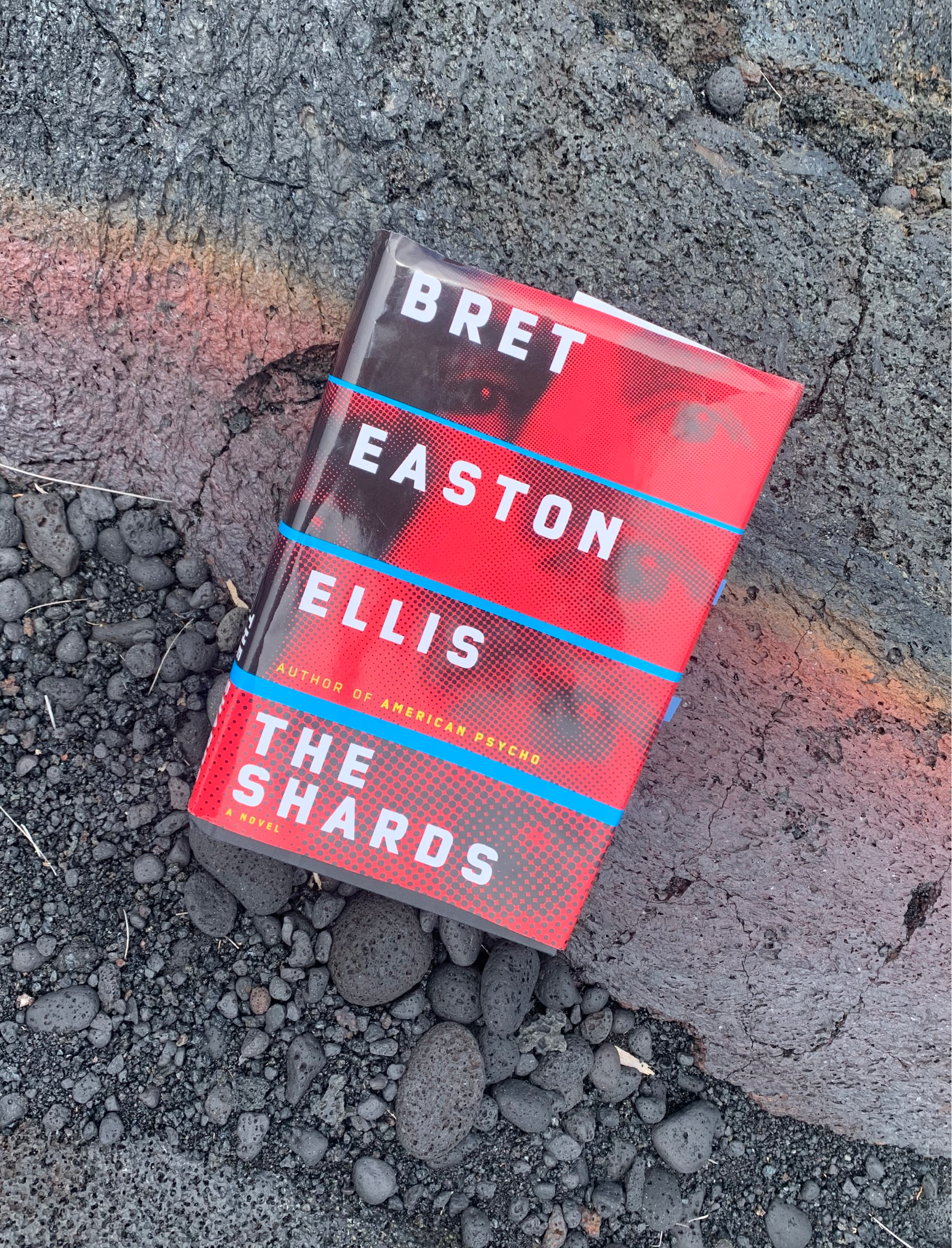
US cover designed by Chip Kidd

Bret Easton Ellis is an auto-buy author for me. I’ve read all his fiction novels -devoured them in high school. They were something my sister and I bonded over. As soon as we finished one we’d buy another. Trading them, talking about them. We obsessed over the Less than Zero book and the Rules of Attraction movie (hot take: The Rules of Attraction movie is better than the book IMHO).

He stopped publishing fiction novels after 2.5 decades of regular releases. The last being Imperial Bedrooms, a novel based on the excruciating process of adapting his book, The Informers, into a mediocre movie that lost money at the box office. I heard him say in an interview that he would never again write another fiction novel. So I thought that was it - until The Shards came out this year.
I was delightfully surprised to see the announcement of The Shards. Of course, I immediately thought of my sister and we talked about it briefly. My sister passed away just before the book was released. Without her, I couldn’t get myself to read it on release day like we would have done together in the past. I couldn’t finish any books for months. But eventually The Shards helped get me out of my reading slump.
The Shards is about wealthy, privileged teenagers in Los Angeles in the 1980s. It’s about that end of summer, beginning of senior year in high school when the safety of the known starts to unravel. It’s exciting to think of what is next. What is beyond this small world you’ve known? But also unnerving and formidable - the unknown. What will come of your relationships? Who will you become?
It’s a coming coming-of-age murder mystery that follows the protagonist’s through his many private and public lives and relationships.

About the cover
Chip Kidd designed the US hardcover of The Shards, which is the cover I’ll be focusing on. In an interview with Debbie Millman, he said “It’s one of the first cinematic covers that I’ve done that involves sequential imagery”.
The title typography is contemporary in its all caps bold san serif. Horizontal neon blue lines divide the author’s name and the sequential imagery. The images are 4 pop art-esque photographs of someone’s eyes getting closer and closer. And the closer we get the blurrier and more abstract the image becomes.
I get the feeling that this person is being spotted. Something targeting or voyeuristic about it. Maybe the person looking is being caught.
The novel has some themes of voyeurism and the feeling of being watched. The highly saturated red and blue seem to represent blood and knowing the content of most Bret Easton Ellis books we expect some violence and bloodshed.
The bright red monochrome images remind me of acmodernized version of old black and white film development. It feels like you are looking at something old that is being made new again. The novel is written from the perspective of a 56-year-old man retelling a story from his high school days.
The UK version is designed by Michael Collica. It has a shabby chic, imitating pre-worn jeans, look to it with matching vintage typography. It’s kinda cheesy but that’s why I love it.

The paperback version was recently revealed. It has a CW circa 2000s vibe to it with a perfectly manicured SoCal prep on a chase lounge by the pool, but then in typically BEE fashion there’s a chaotic splash of blood.

About the photographer
The cover image is based on a photograph by Steve Speller, a photographer that got his start in 1985 and has done a lot of portraiture for magazines. When I first started looking through his catalog I immediately spotted a photograph of New Order - so of course this guy would be associated with Bret Easton Ellis.
Land Traces is his current project.

Below are portraits of his that I thought were compelling and all had a great focus on eyes. I don’t think I ever came across the image that was used for The Shards cover but I can see how it follows his style.


About the designer
Chip Kidd must be one of the most famous book jacket designers out there. He graduated from Penn State University with a degree in graphic design and started working at Knopf in 1986, where he still works as associate art director. He is also a comic book fanboy and supervised graphic novels at Pantheon. In addition to his design work, Kidd authored several books including "The Cheese Monkeys" and "Go: A Kidd's Guide to Graphic Design."
This was not the first time he worked with Bret Easton Ellis. He also made this shadowy figures series:

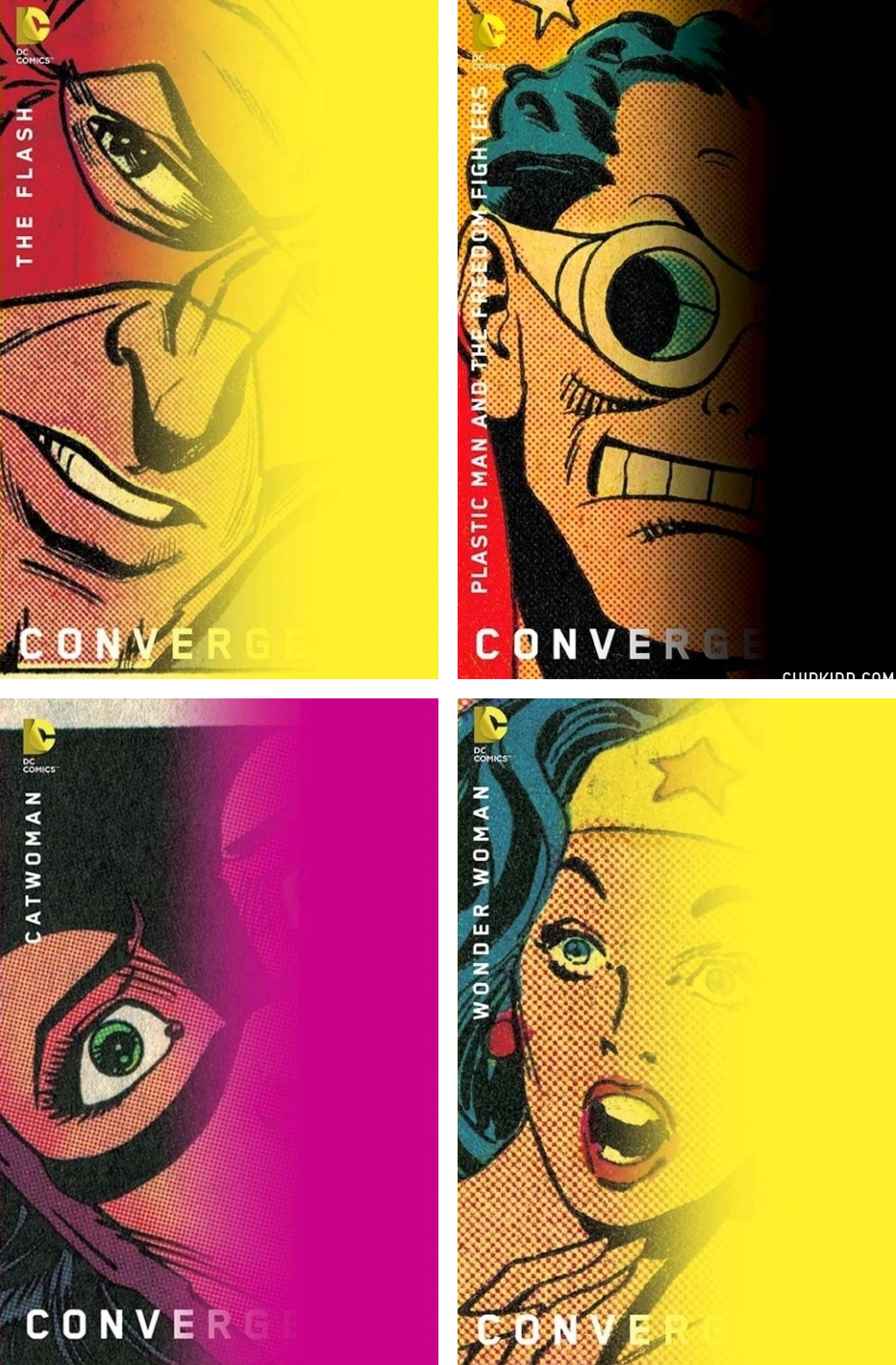
He did a whole DC comics series that reinforces how a close-up on the eyes is really what gives you away:
A random assortment of his other well-known covers (including Donna Tart, a classmate of Bret Easton Ellis):

Kidd on his design process:
“Along the way, I may or may not involve photographers or illustrators or any amount of ephemeral detritus that washes up on my shores in the pursuit of solving the problem. And that is what it always amounts to: visually solving a problem.”
Related reads:
Chip Kidd on designing The Road: “Every-one involved finally agreed on the design, soon to be adorned with an “Oprah’s Book Club” sticker, which allowed any remaining doubts of success to instantly evaporate. Bless you, Oprah.”
🎧 Design Matters podcast with Chip Kidd
An interview in Vanity Fair with Bret Easton Ellis on The Shards and his feelings about NYC.
Less Than Zero 1st edition on AbeBooks. Obsessed with this cover.
You can purchase The Shards at Bookshop.org
Recent reads:
Anatomy of a book cover: The process of book cover design
How novellas became novels [a fellow substacker]
SCARY COOL SAD GOODBYE’S ULTIMATE BEACH READS [a fellow substacker]
🎧 The art of literary translation and revisiting Bridget Jones’s Diary