


Looking at Tom Wolfe reissues
Milton Glaser, Seymour Chwast, and proto-post modernism


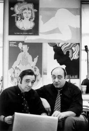
Picador is reissuing Tom Wolfe’s books with newly designed covers by Seymour Chwast. The reissues started rolling out in August and will continue through May 2025. The designer, Seymour Chwast, went to design school with Milton Glaser in the 1950s. A few years after graduating, they started a design studio with Edward Sorel and Reynold Ruffins called Push Pin Studios.

If you are not familiar with Milton Glaser’s name, I’m sure you are familiar with his work. He famously designed the 1966 psychedelic Bob Dylan poster and the I <3 NY logo in 1977 (which he gave to the city for free because he really did love NY - the city now makes ~30 mill annually from that logo).
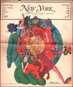
Two years after the Dylan poster, Glaser cofounded New York Magazine and wrote the popular Underground Gourmet column. He designed the cover of the NY Mag issue above with a feature story about Ken Kesey written by Tom Wolfe which would eventually be published as The Electric Kool-Aid Acid Test with Glaser’s accompanying kaleidoscopic illustration on the cover.

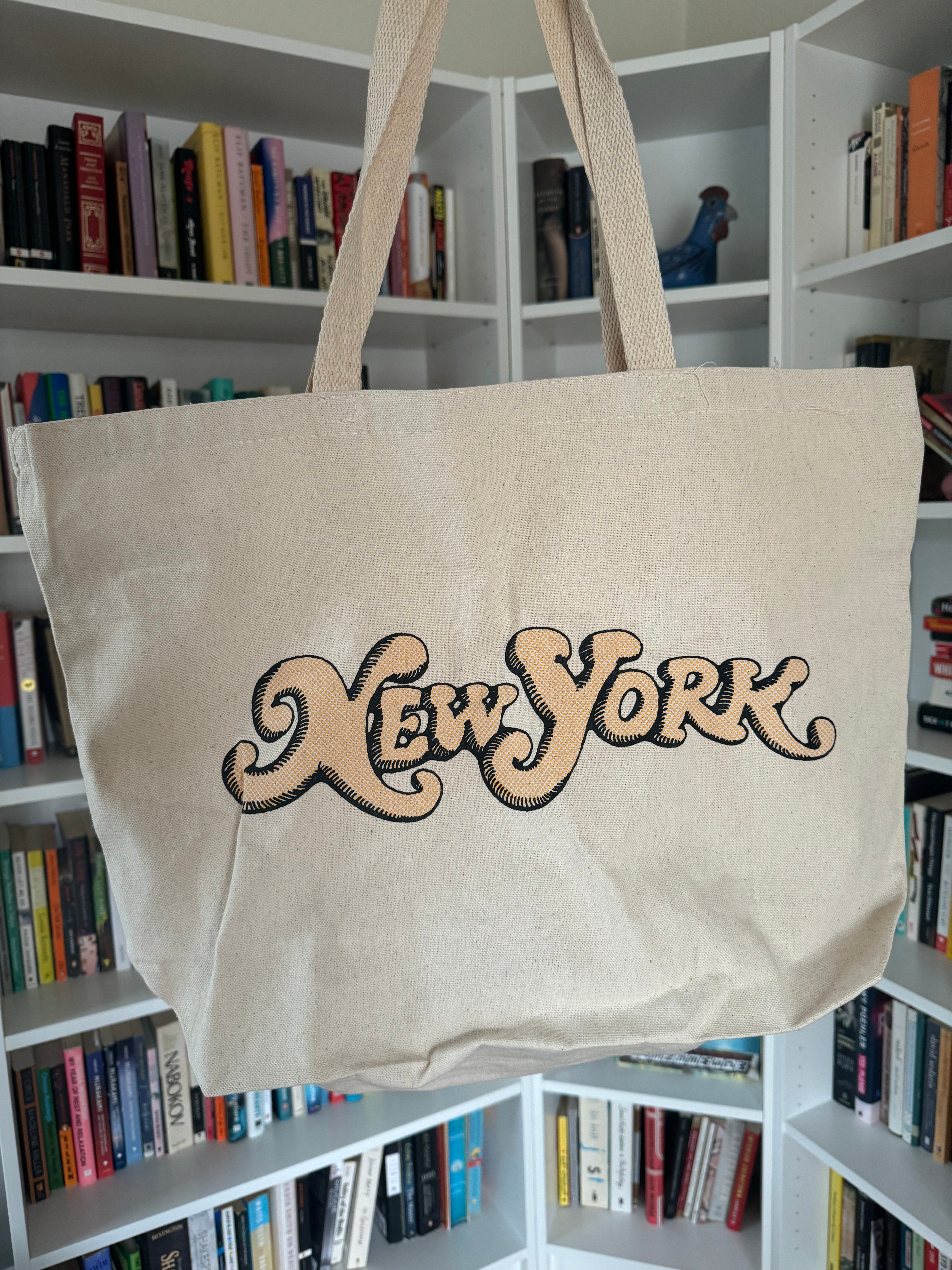
Last month, I subscribed to NY Mag and low and behold they sent me a complementary tote bag printed with “New York” in pillowy serif lettering by none other than Milton Glaser.
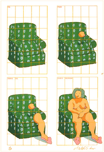
He even contributed designs for The Paris Review all of which goes to show he must have liked literature or at least like designing for and supporting literary publications.
Glaser and Chwast started designing books in 1954 when they teamed up at Push Pin Studios.
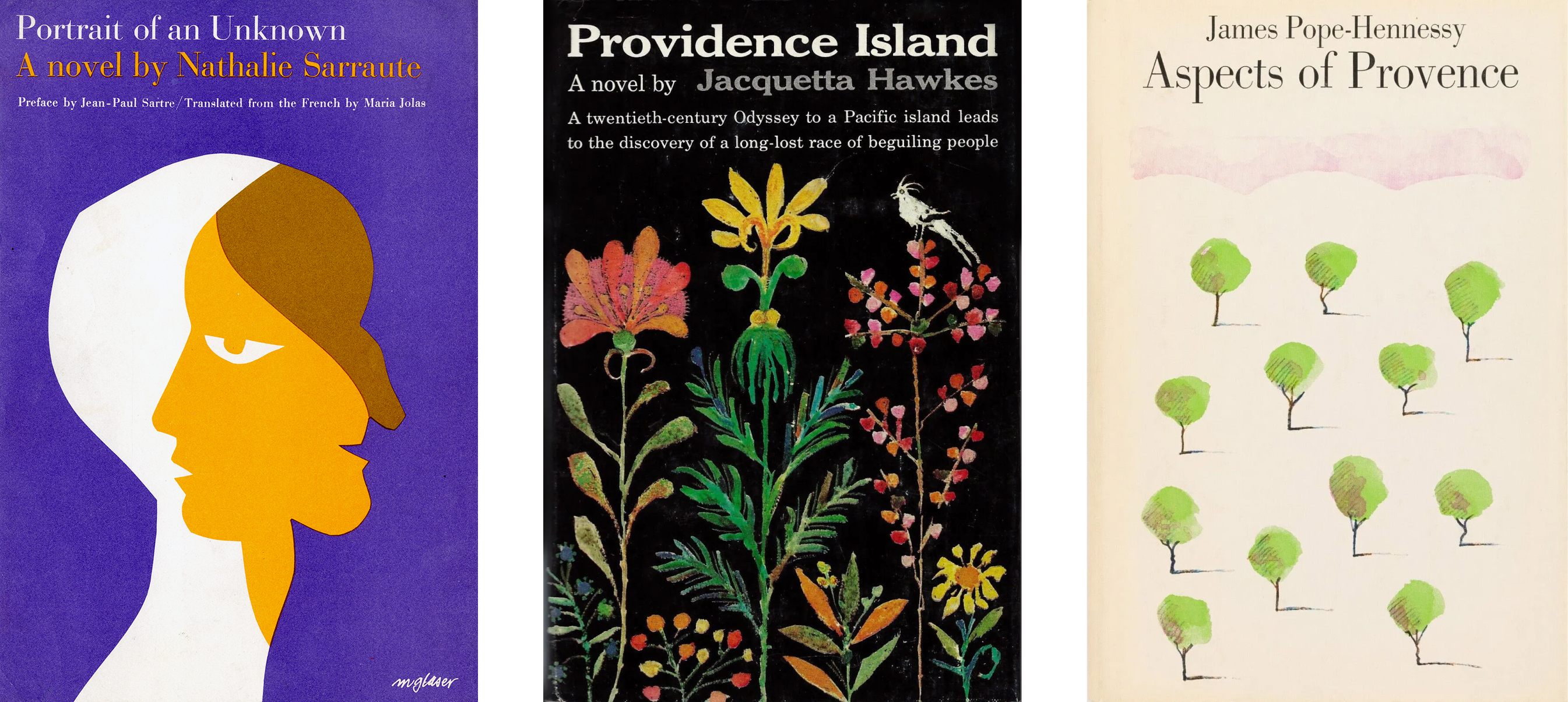
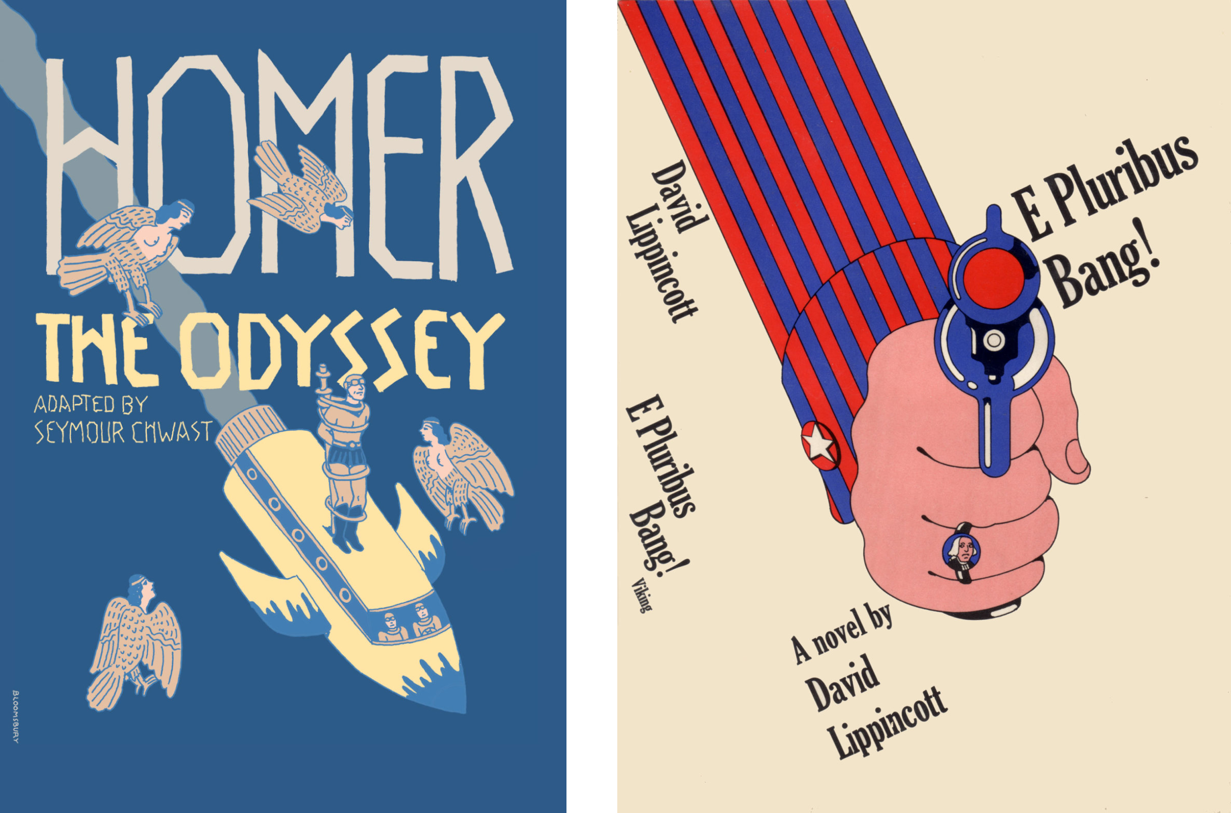
Glasers book cover designs:


And some Seymour Chwast book covers:


I imagine Seymour Chwast, after getting tapped by Picador to do the Wolfe reissues, thinking back on the Push Pin design studio days with Glaser while coming up with his new designs.
After getting news of the latest covers, I decided to peruse old Tom Wolfe covers and I noticed that the first edition cover for Radical Chic & Mau-Mauing the Flak Catchers looked a lot like Chwast’s reissued Wolfe covers.

Turns out that the first edition was another Glaser design. Chwast must be paying tribute to him with this reissued collection, but of course in Chwast’s own rugged illustration style. The “Pop-up Bra Fashions” cartoon captures the same playful and simple line work in the new Tom Wolfe covers.


Steven Heller’s profile of Chwast exemplifies why Chwast was such a good pick to do Wolfe’s book cover designs.
“Seymour’s art was postmodern long before the term was coined. Yet it was resolutely modern in its rejection of the nostalgic and romantic representation, as in the acolytes of Norman Rockwell, that had been popular in mainstream advertising magazines at the time. Instead of prosaic or melodramatic tableau, Seymour emphasized clever concept. What makes the very best of his art so arresting, and so identifiable, is the tenacity of his ideas—simple, complex, rational, and even absurd ideas. Droll humor and conceptual acuity were the foundation on which he built a visual language that advanced editorial illustration beyond pictorial mimicry of a sentence or headline. His images complemented and supplemented the words, gave them additional layers of meaning. What’s more, Seymour is master of the visual pun, which enables him to manipulate pictorial concepts as a sculptor shapes soft clay.”
All the reissues so far:


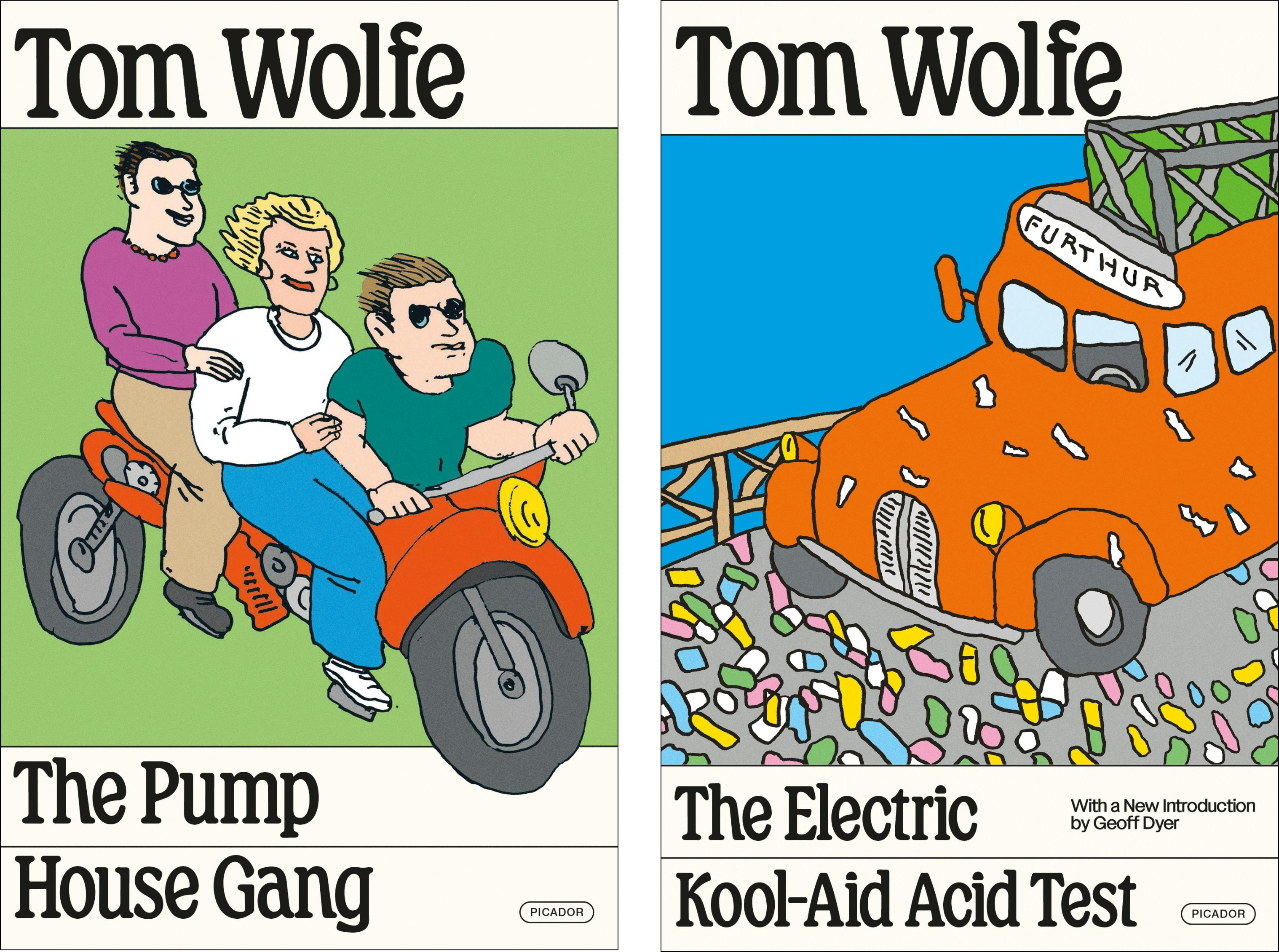


The typeface looks like Windsor, which was designed in 1905 but became popular in the 1970s and 1980s, making it a fitting choice for Wolfe’s books. It’s a soft and friendly serif full of delightful little movements in the letters - like the exaggerated bend at the top of the ‘f', the downward slope of the bar on the ‘e’ and how the ends of ‘n’ and ‘m’ look like they are tapping a foot outward.
Publishers reissue books with fresh cover designs to gain new audiences for old books. Chwast accomplished a balance between modern and retro design in these covers, which I appreciate as a way to garner interest from younger generations while still marking the time period when the books were written.
In August of this year, Chwast turned 93 and is still designing at Push Pin Studios.

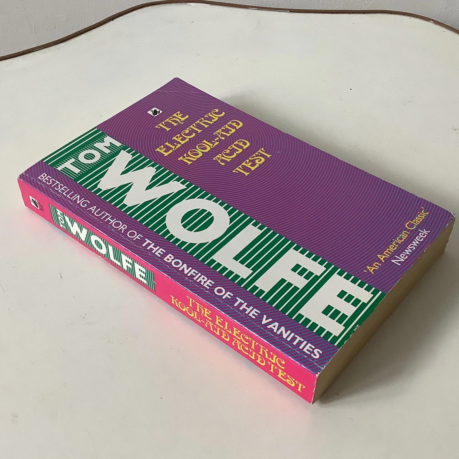
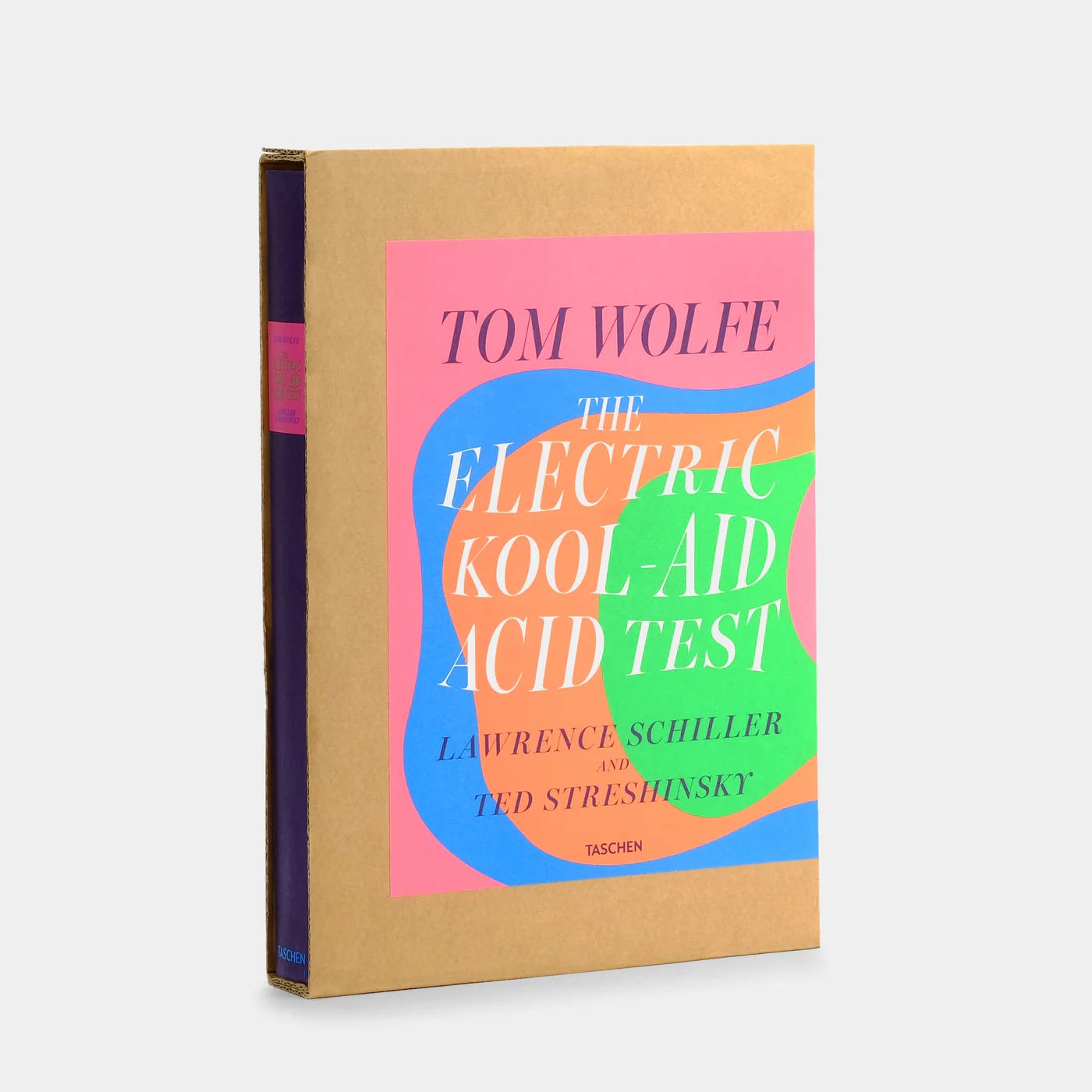
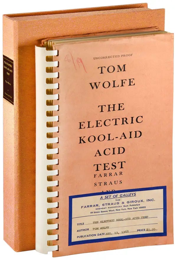
And for the remaining The Electric Kool-Aid Acid Test covers, a retrospective:
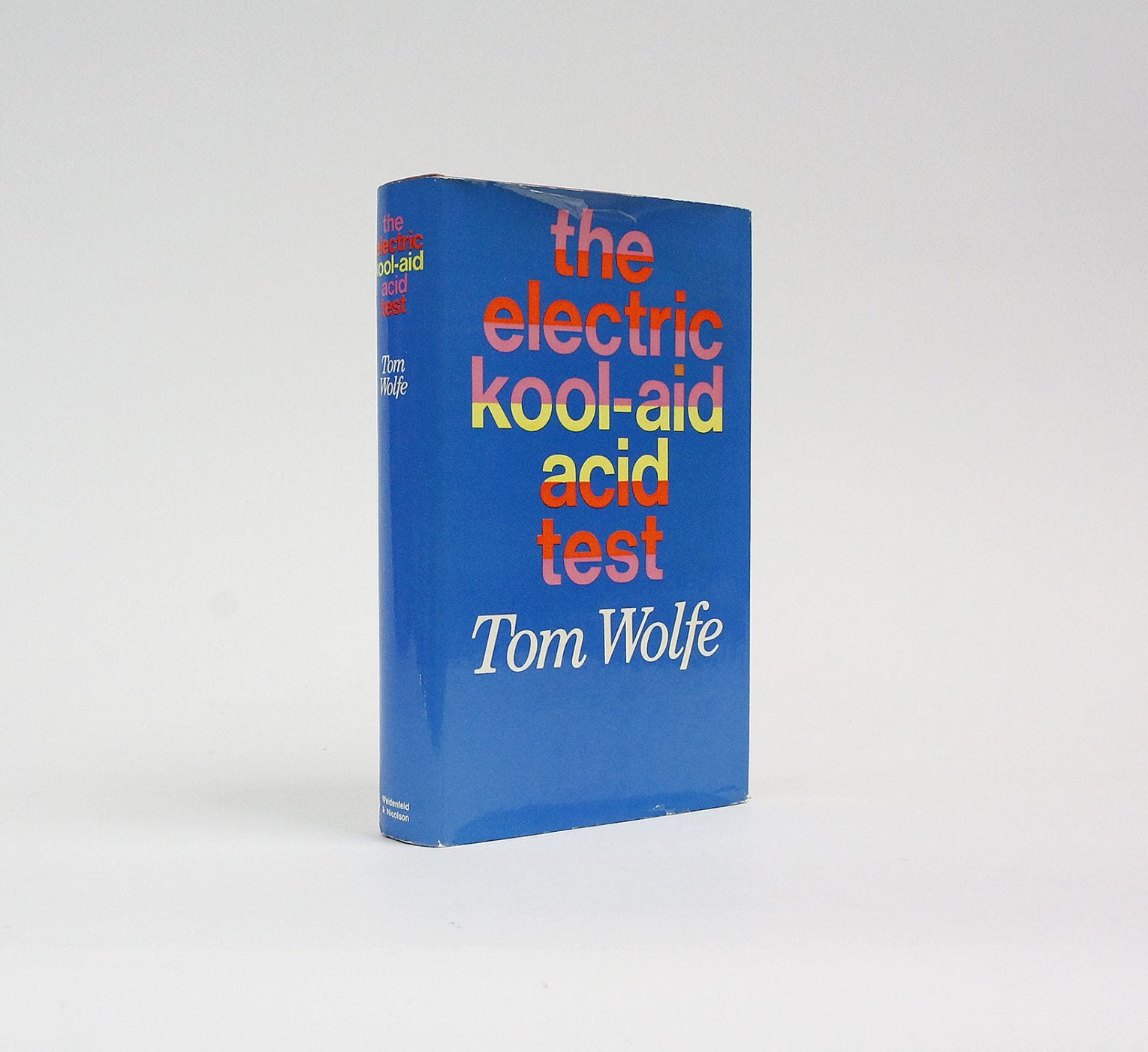
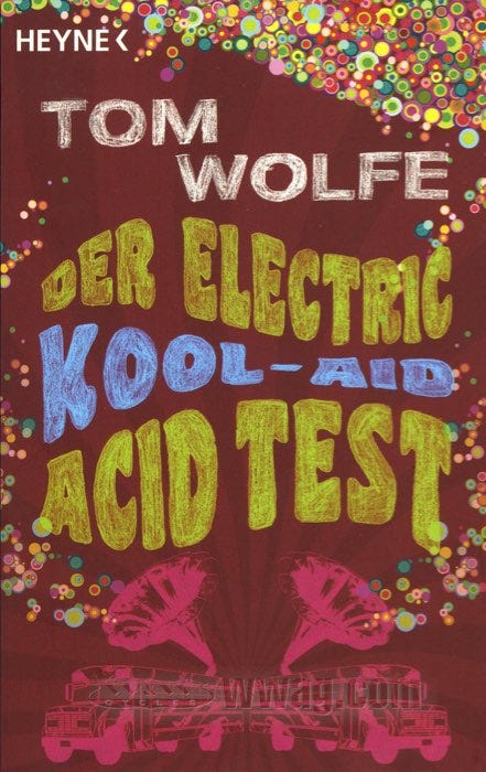
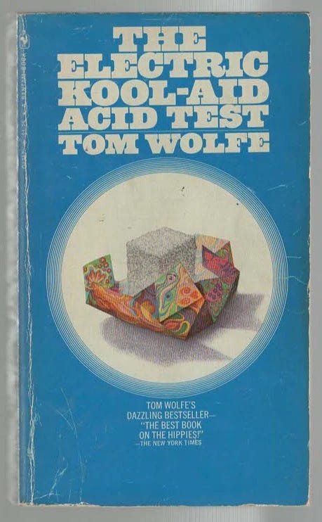
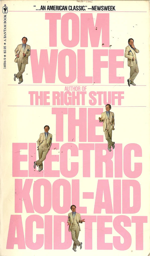
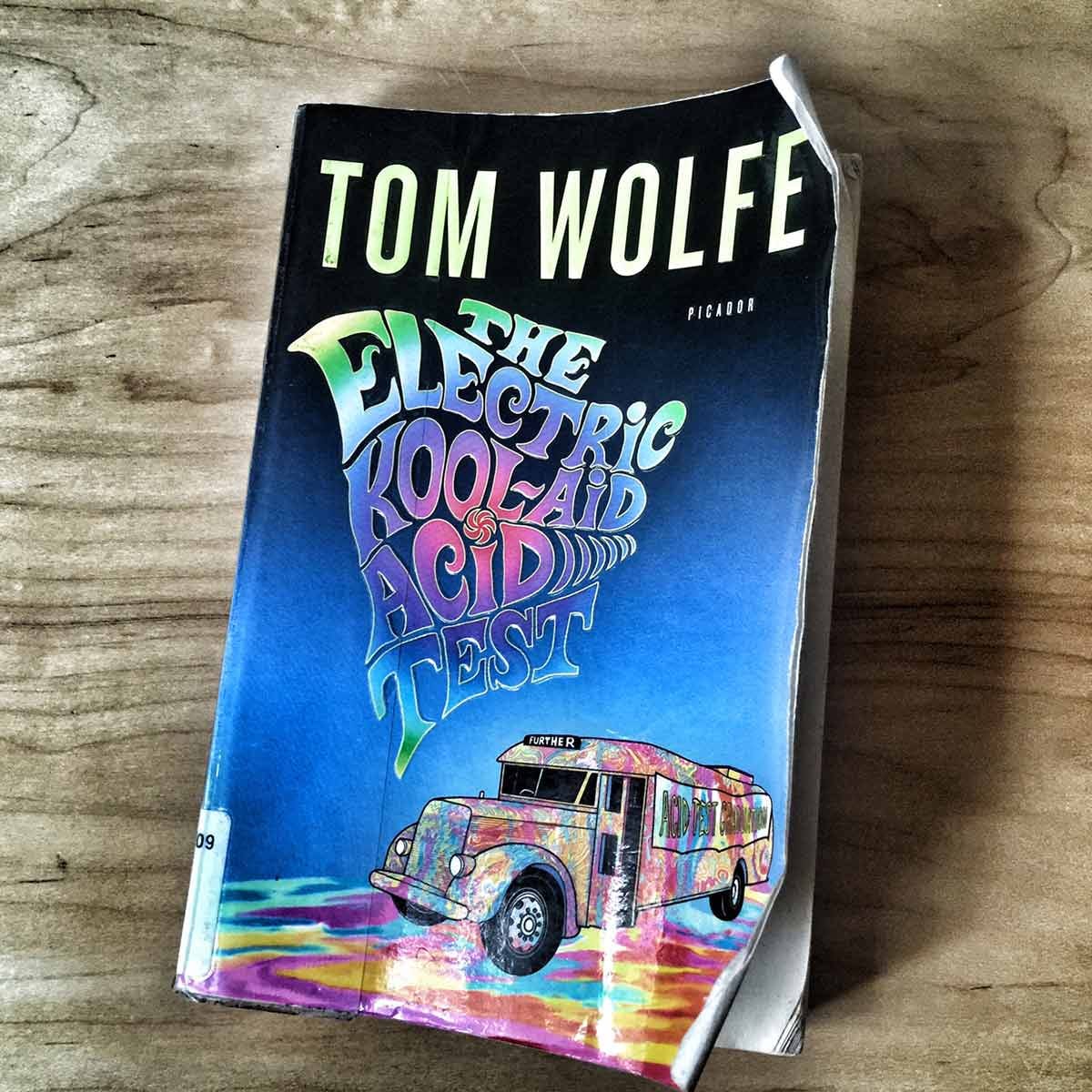
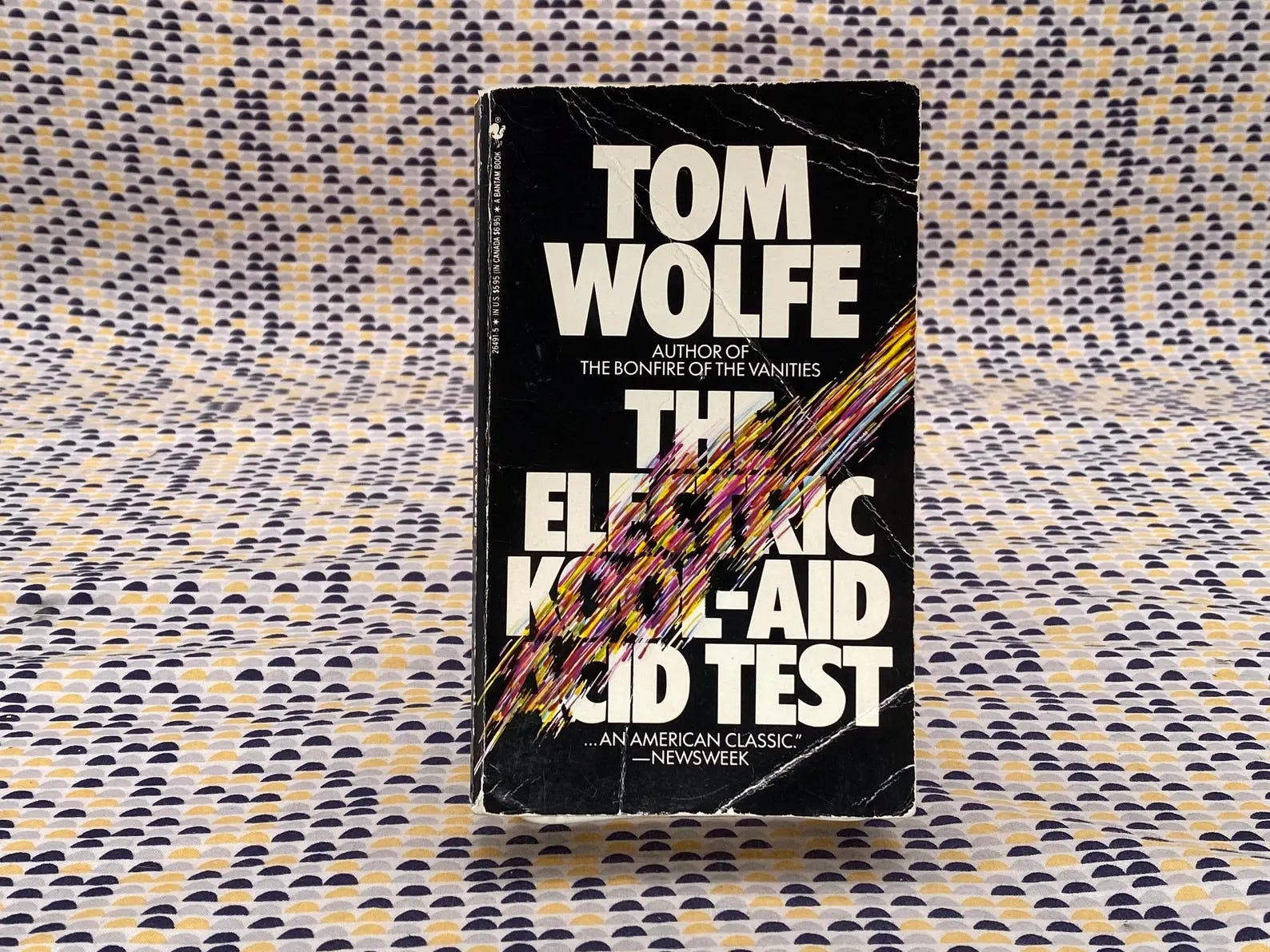
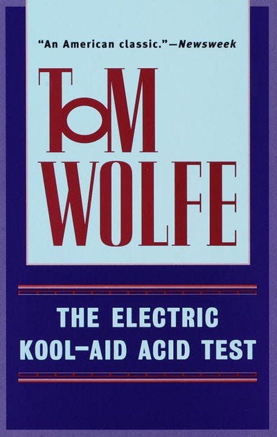
The final one is the version I read in high school, so of course it’s the one I’m most fond of. I misplaced my copy or likely lent to someone indefinitely.
Do you have a favorite cover?

Thank you for reading Looking at Books!
Support my newsletter by sharing, subscribing, purchasing books for yourself through this bookshop link, or buying me a book on my wishlist :)