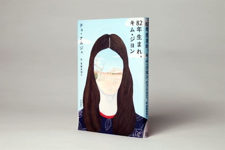
In December, I took two weeks off to travel to Tokyo and Kyoto. The design of pretty much everything there is enviable and a joy to study. One highlight was visiting the 21_21 DESIGN SIGHT gallery in Tokyo’s Roppongi district. I was there for the “Modes and Characters: Poetics of Graphic Design” exhibition. It focused on technology’s impact on graphic design in Japan from the 1990s to the modern day. There was a great section on Japanese book design. One designer who caught my eye was Naoko Nakui. I realized I was already familiar with her work on the Japanese cover of Kim Jiyoung, Born 1982 by Cho Nam-Joo.
The cover
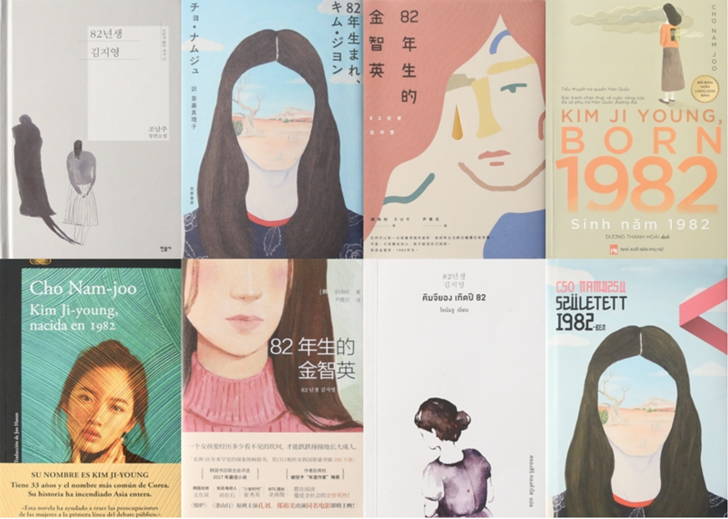
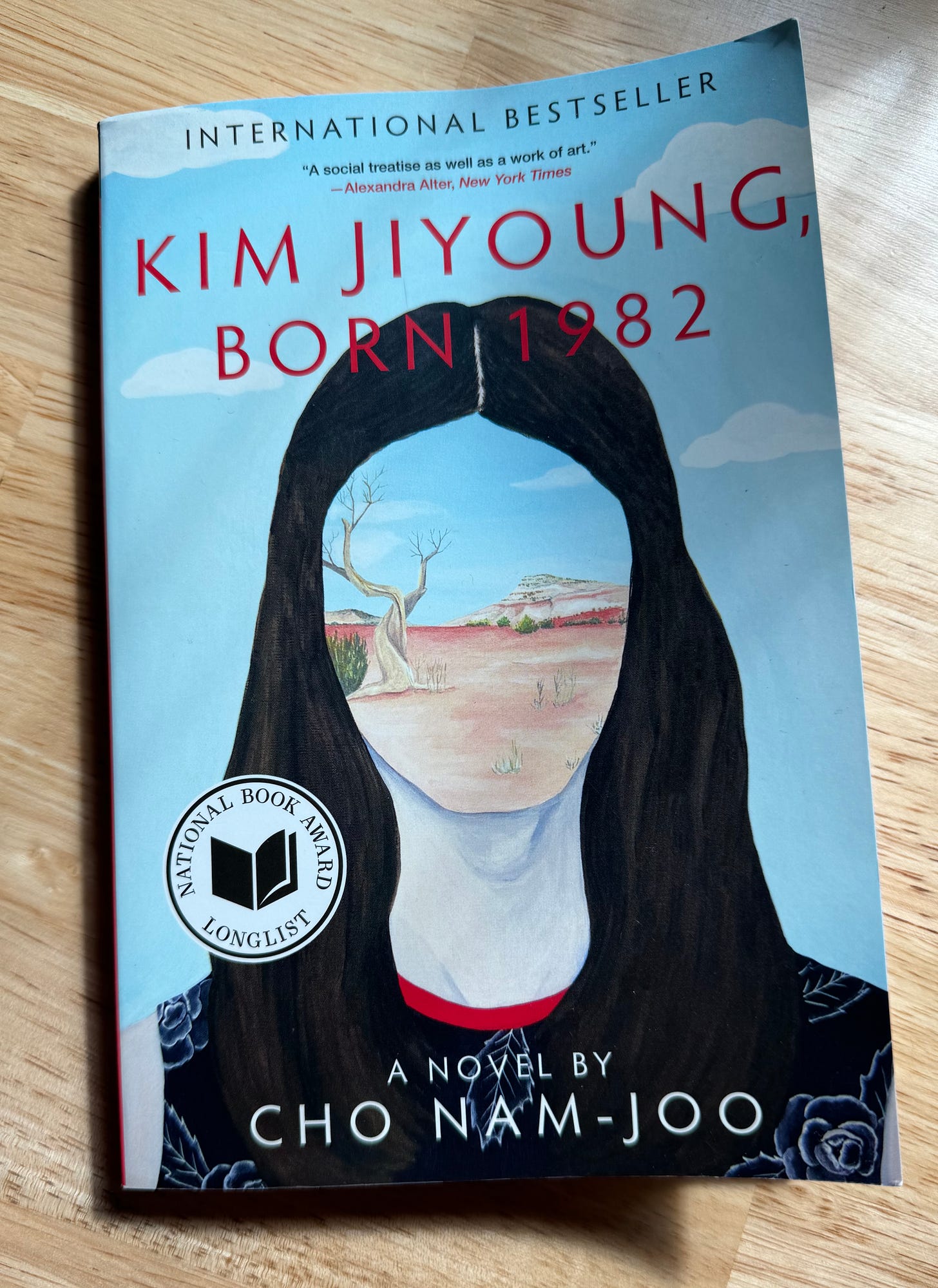
The book was released in October 2016 in Korea, December 2019 in Japan, and April 2020 in the US, and 14 other countries at various times. The cover that was first released in Japan prominently features a surrealist portrait by Mariko Enomoto.
Surrealism is an art movement that started in the 1920s after WWI characterized by dreams, the unconscious mind, the destruction of rationalism, and the disillusionment of societal norms. The most famous surrealist portraits probably come from Magritte.

Mariko Enomoto’s painting of a woman without distinct facial features could represent how women in society are seen without unique identities, emotions, and goals of their own outside motherhood. It’s also a way to perhaps generalize women to show how Kim Jiyoung’s story represents so many women’s experiences of oppression. And the desert is a harsh environment to survive in, especially all on your own.
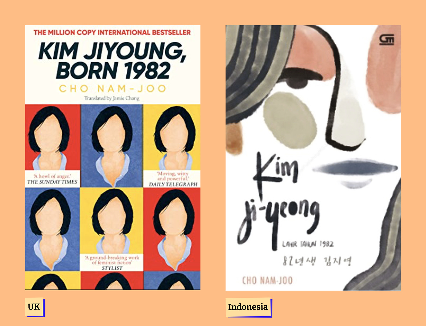
I prefer the cover designed by Nakui to the UK cover which, also has feminist qualities to the faceless faces, but I like that the surrealist portrait doesn’t simply flatten and obscure the subject’s face, rather it offers more depth of interpretation and meaning.
While researching for this post, I found this fascinating academic paper comparing the UK cover and the Indonesian cover. The premise of the paper is to show how cultural beliefs impact a book’s cover design. The paper tries to prove how the UK cover is more feminist than the Indonesian cover because feminism is more widely accepted in the UK.
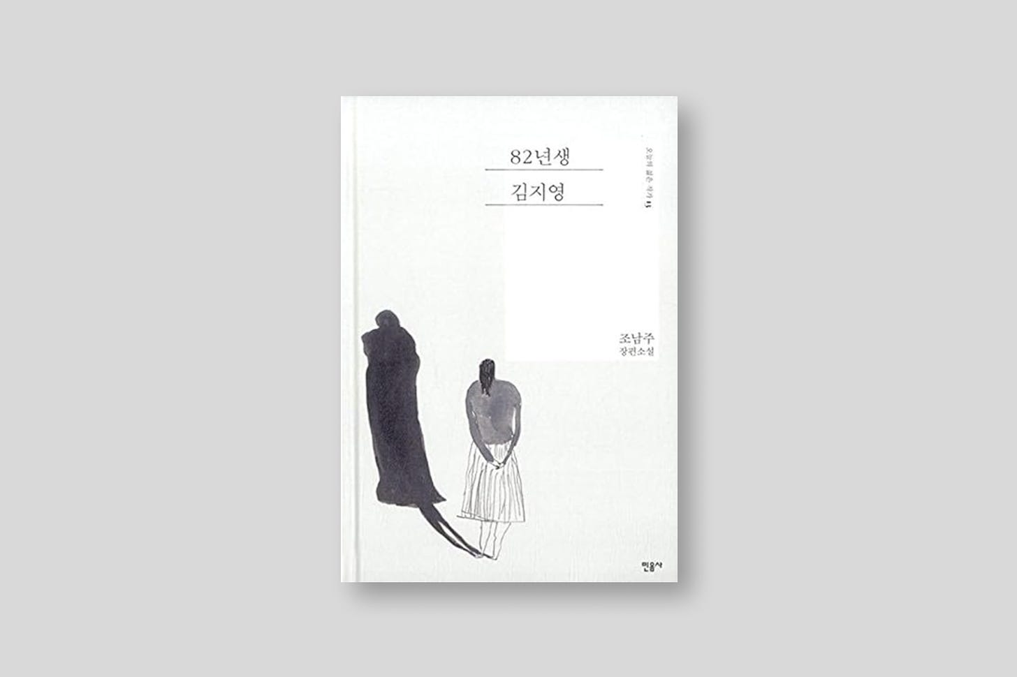
The first edition cover is a line drawing also focusing on an unseen identity and isolation.
The painter
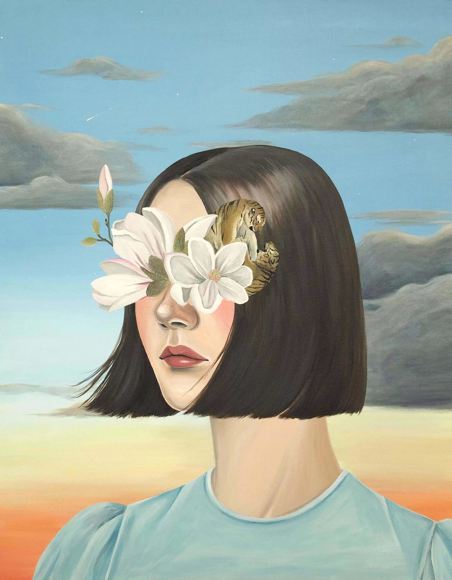
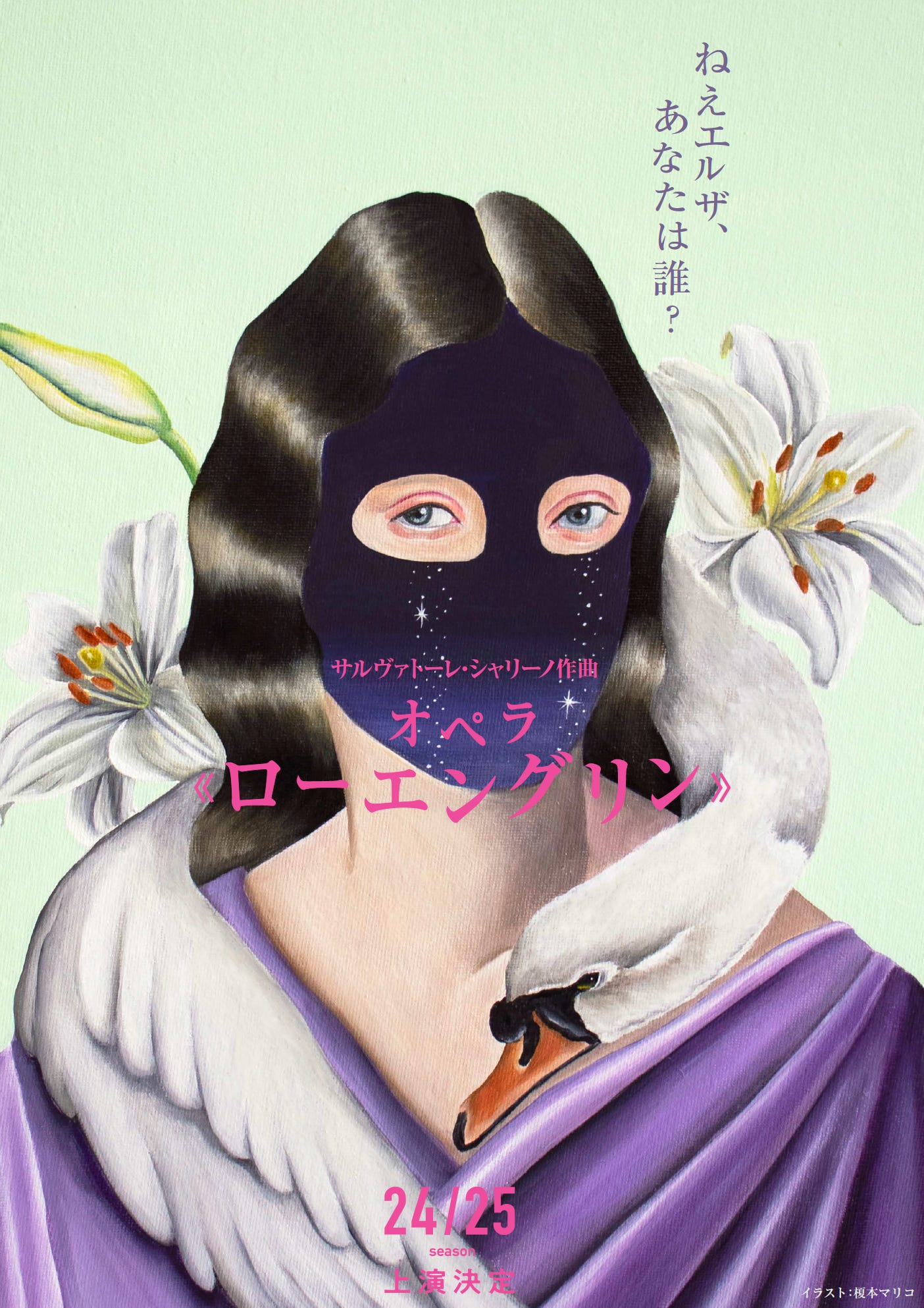
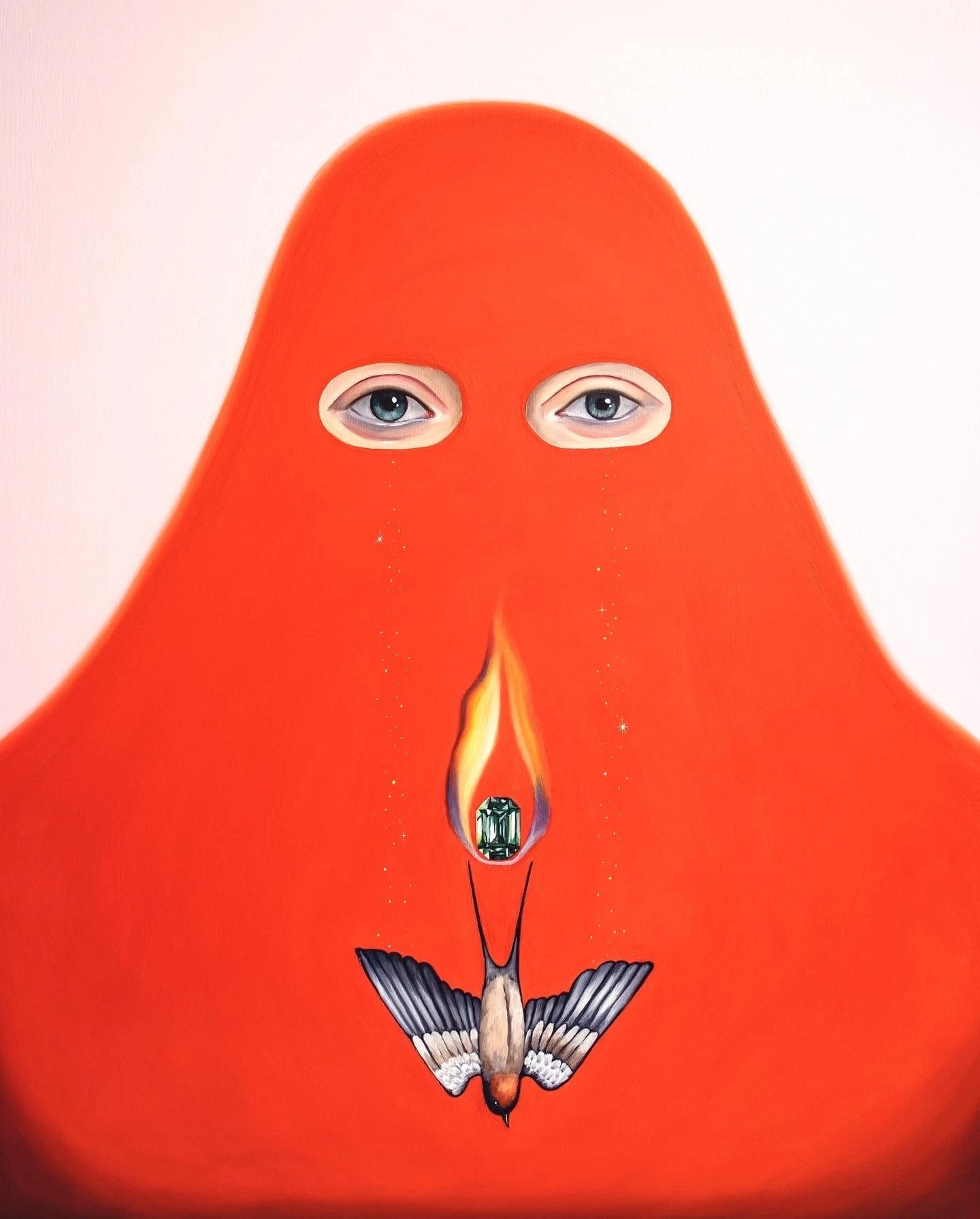
Mariko Enomoto is a Japanese artist born in 1982 and has a lot of wonderful work in surrealist painting. She studied fashion in school and is a self-taught painter.
The designers
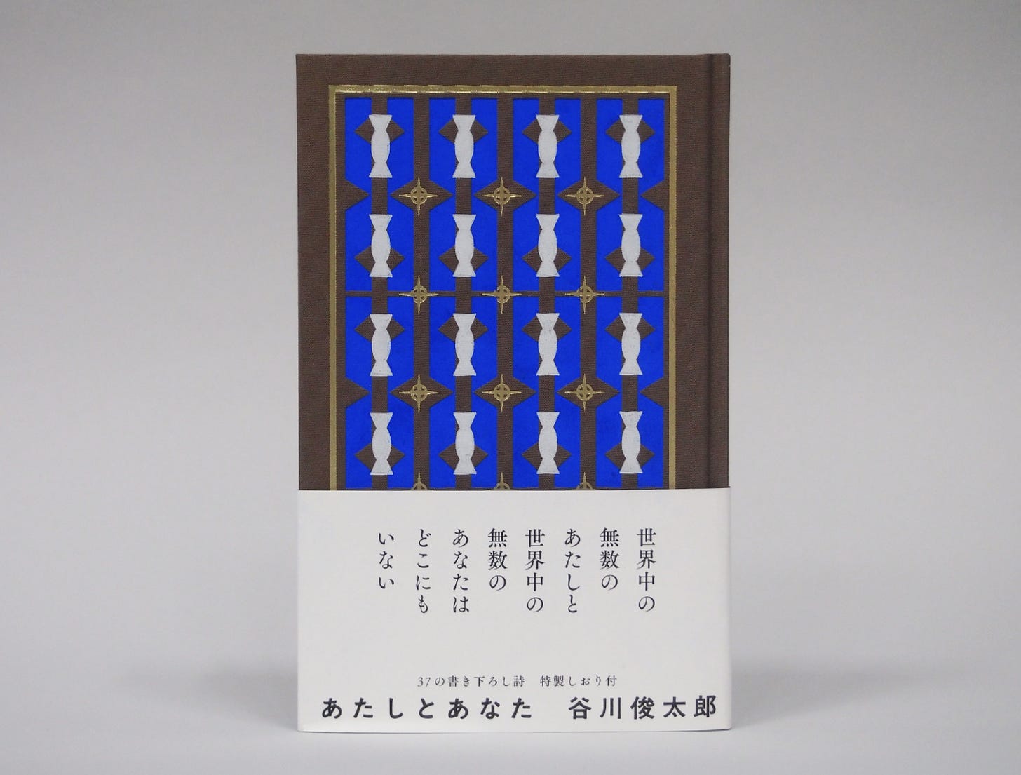
Naoko Nakui is passionate about the physical materials of bookmaking so much so that she wrote a book about it. She also thinks a lot about the mood of the typography and how to pair a book’s content with the appropriate typeface. And loves cats as evidenced by her instagram.
I had trouble finding a lot of information about her but I thought these two quotes offered a nice illustration of who she is as a book designer.
“She frequently visits printing studios and bookbinders to involve herself in the activities of bookmaking itself. These experiences led her to the idea of developing a new type of paper to suit each particular book. Fine examples are seen in the luxury specifications of her works… Book design is giving form to written words. This need not be confined to flat graphics, for a book is a physical object, with a certain weight, Nakui’s work eloquently shows how physicality is also important to book design.” - 2121 Design Sight
“A "book" has no shape in its textual form. Therefore, I think that book design is the task of materializing intangible text. In the materialization, there are various elements that compose the book as well as the text. Among these elements, the ‘letter’ (typeface) is like a ‘voice sound’ that embodies text, so I think that it is definitely a major element that determines the mood of the book.” - Naoku Nakui
In 2022 she won a best book design award for Fujiko F. Fujio, 100 More Years with Doraemon.
“All volumes have hardback covers, bound in the series first cloth and are screen printed in silk, which incorporates gold leaf. The thread-bound makes turning the pages of these small booklets extremely enjoyable, the paper is high-quality and the printing more than perfect. The abundance of high-quality bound editions makes the heart of every anime fan beat faster. But even “non-specialist” readers are magically drawn to the collection. Even the playful and high-quality typographical design of the spines, which jump out of the collection boxes, have a special aura.”
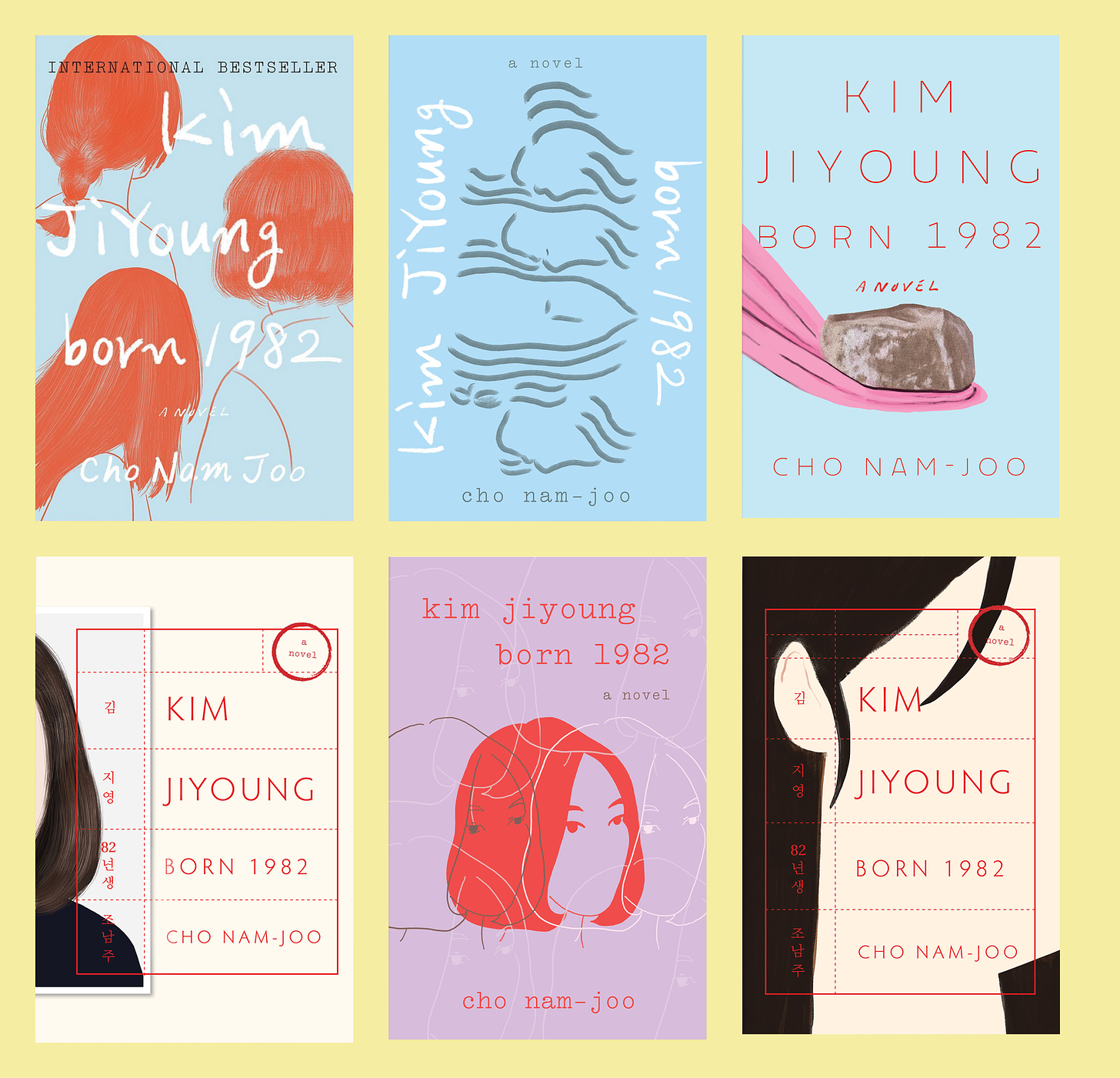
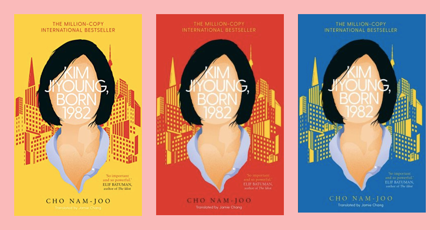
The US book jacket was designed by Yang Kim who works at Crown At Penguin Random House. She designed alternative covers for the book which are all lovely and shown below, however, the final published book ended up using the same illustration as the Japanese release.
Support Looking at Books by sharing, subscribing, purchasing books through this bookshop link, or buying me a book on my wishlist :)






Fascinating as always Renee!
I love what Nakui had to say about visualizing the voice of the text. It’s so interesting to compare covers across countries too - I often browse Blackwells because I like the UK covers better. When I look at my shelf and remember what I’ve read, the thing I interact with in my memories the most is the cover!