The Goosebumps aesthetic is iconic and so 90s. While perusing Goosebumps covers I couldn’t believe how many feel so familiar to me - my sister, cousin, and I must have spent all our Scholastic book fair money on the series. I remember spending hours getting lost in the covers - imagining whole stories out of them.
The illustrations are striking with so much detail and made with high contrast saturated colors. There is also enough mystery to continue examining and scanning through all the dark crevasses. The images made me feel small and made the world feel unknown. Many of the angles are done from a child’s perspective where the character’s eyes are looking down at you.
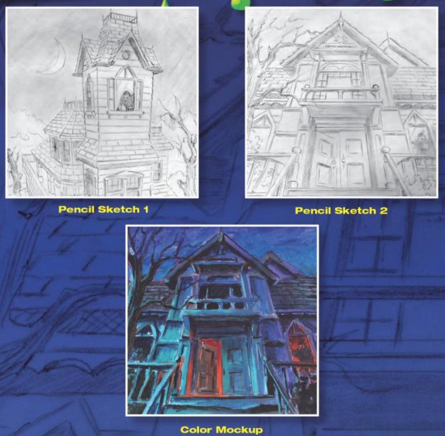
The cover of It Came From Beneath The Sink! is weirdly one of the most memorable covers for me. I’ve spent an inordinate amount of time reading people on the internet’s opinion of Goosebumps book covers and no one seems to bring this one up. I’m confessing this so that if anyone else out there thinks about this cover occasionally they don’t have to feel alone in their horror.
The cover designer
Tim Jacobus did the majority of the Goosebumps covers - there were maybe 2 out of the 62 original books that he didn’t do and that was when Scholastic was still deciding who they wanted. Jacobus did the very first one though -Welcome to the Dead House.
Goosebumps started as a 6 book series and then became a monthly publication where R.L. Stein wrote a book in 10 days. Jacobus would get a short description of what it was about and then design the cover in a week. He would send off an acrylic-based 20x20 inch painting to Scholastic. Then someone at Scholastic would finish it with the Goosebumps slime and logo. For some covers, he would use a photo model. Jacobus on his process:
“I always got up at 5 AM, and they used to take 30, maybe 40 hours to do. I still work early, and music is always on. I still listen to Yes, and I love progressive rock.”
One story I liked from The Art of Goosebumps book was how everyone at Scholastic loved the Say Cheese and Die! cover so much, but it had very little to do with the content of the book, so they made R.L. Stine add a BBQ scene to the book. I gotta say, maniacally laughing family of skeletons BBQing is pretty memorable.
The logo designer
The most fun thing I learned from researching for this post was who made the Goosebumps logo/typeface. I assumed it was going to be the same person who did the cover art but it turned out to be someone else from the Scholastic family.

Hollie Tommasino, formerly Hollie Rubin, was a graphic designer at Scholastic in the 1990s. I had a hard time finding much information about her - no design portfolio or what she is up to now. The main source of evidence I found on her creation of the Goosebumps logo is a legal document from an intellectual property dispute:
“The "Goosebumps" logo which was designed by a Scholastic employee named Hollie Rubin in or before 1991 and used on the very first "Goosebumps" book and all since, (id.) is the word "Goosebumps" written so as to give the appearance of splashing or dripping liquid. (Compl.Ex. D) In many, but not all cases, the logo appears in green.”
But! The fun thing about learning that Hollie Tommasino made the Goosebumps logo is that she ALSO did all the handwriting for the Babysitters Clubs books including Stacy’s iconic heart dotted i’s.

Honestly, the end of this Vice interview with Tim Jacobus made me depressed.
This is great: Artist Gives Modern Horror Movies Classic Goosebumps Covers
If you want to do a deeper dive on Goosebumps art there’s a whole book on it.
Hollie Tommasino bio here.
Interview with Hollie Tommasino here.
Did you read Goosebumps? What’s your most memorable Goosebumps cover?


