Happy belated-pub day to Parade by Rachel Cusk which came out yesterday in the States.
I was first introduced to Rachel Cusk when Dog Eared Books in San Francisco had the first book in the Outline series on their recommended shelf. I later learned that it was originally serialized in the Paris Review alongside illustrations from Samantha Hahn.
Then FSG commissioned Strick&Williams to design covers for the trilogy. Lit Hub has a great write-up about the design process for the original Outline trilogy covers.
“The lined page is a metaphor for the life of the narrator, a writer herself, and the turned corners permit a slice of imagery that hints at the themes from each of the three novels. We searched widely for photographs that would relate to each of the three books; water for stories from the Aegean Sea, an ornamental bird and wallpaper for a meditation on homecoming, and microphones to represent fame.” - Charlotte Strick
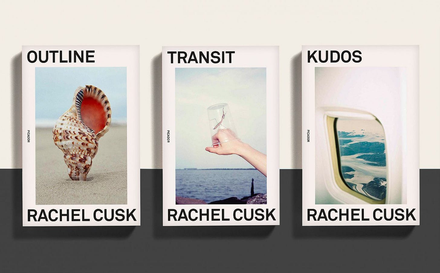
In 2016 Rodrigo Corral was commissioned by Picador to design covers for Outline. Corral was born in Long Island and lives in New York City. He is the creative director at FSG and also runs his design studio, Rodrigo Corral Design Studio.
I’m thinking you could line up 10 people in a room and show them those covers, and for most of them, they might not even register any of the elements. They may not even see the silhouette on The Brief Wondrous Life of Oscar Wao, or they might not make heads or tails of what the bubbles on the clouds on The Fault in Our Stars mean. But personally, those ideas come from the content—responding to the content of the book, and it staying with me and feeling like it has power. It has lasting value. Readers want to go on a journey. They want to feel like in some ways they’re discovering something, they’re learning something, they’re gaining something. I think a jacket just gets to add to that story. - Rodrigo Corral
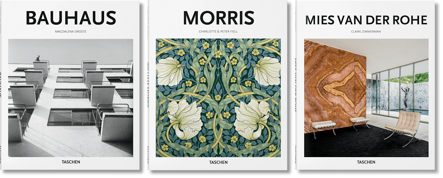
Corral’s design became the signature for all of Cusk’s books moving forward. It’s now part of her brand. They remind me a bit of the Taschen Basic Art series covers - minimalist, clear readable sans serif black text on a white background with a photograph. Many of the photos taken for Cusk’s covers are by Charlie Engman.
Cusk’s books are so recognizable now you barely even need to read the text to know it’s a Cusk book. When something becomes recognizable you know what to expect from it. It’s a good heuristic for finding your next read. You can’t decide which book to get at the bookshop but you liked the last book that looked like that so you pick up the next one.
Parade’s cover follows a similar design pattern to the previous Corral designs but this time the layout gets a white space remix to signal to us this is something *new*. Corral’s design is so pleasing to the eye where all the pieces look anchored by gravity to their place on the grid.
Instead of using Charlie Engman’s photography, Parade features a photograph of a painting by Anna-Eva Bergman from 1981. Perspective is used nicely here to draw your eye to the most important elements - title and author name.
Bergman was born in Stockholm in 1909 and mostly lived and worked in France. She often mixed acrylics with gold and silver metal leaf giving her work a luminous quality and deep texture.
And now more Outline covers.
Dan Mogford’s design is a literal outline of the title Outline but also feels Agean Sea-y.
In Faber & Faber’s cover, we have a drawn outline of a person.
This one looks like a synonym to the original FSG cover - ocean with notebook paper but a little too skeuomorphic for Cusk’s style I think.
Related reads:
Thank you for reading Looking at Books! Support my newsletter by sharing, subscribing, purchasing books through this bookshop link, or buying me a book on my wishlist :)


This is so interesting I love it!! Especially since I just found books 2&3 of the outline trilogy at the used bookstore and had to put them on my instagram feed. Everything must be instagramable now
This was so fascinating!!!